I am Palesa Ndala, a dynamic multi-disciplinary designer located in Johannesburg. With notable expertise gained from designing for a leading television network, I am adept in various design tools and mediums.
Specialising in graphic design, motion design, and illustration, I utilise a suite of software including After Effects, Premiere Pro, Adobe Photoshop, Illustrator, and InDesign to create compelling visual narratives.
My passion lies in storytelling through design, infusing creativity and proficiency into each project I undertake.

MY WORK
PRINT, TV AND DIGITAL ARTWORK
I am pleased to share with you a selection of design projects spanning print, TV, and digital mediums. These works exemplify a synthesis of various design principles and techniques, all meticulously crafted to resonate with our company's Corporate Identity (CI) manual.
Embracing a style characterized by simplicity and minimalism, each design is tailored to suit the unique requirements of different shows, target audiences, and clients within our newsroom. This adaptable approach ensures effective communication of our message while maintaining brand consistency.
What sets my work apart is its distinct personality, reflecting an innovative and out-of-the-box approach to design. I believe these pieces not only showcase my skills but also demonstrate my commitment to delivering creative solutions that captivate and engage our audience.
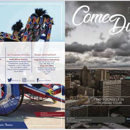
LAYOUT DESIGN -NEWSPAPER INSERT AND ANNUAL REPORTS
The layout designs were crafted to prioritize readability, consistency, and alignment with the company's branding. By incorporating visuals, we aimed to enhance the understanding of complex data.
Ultimately, these designs engage the audience and convey information effectively, making the report both informative and visually appealing.
OPENING TITLE SEQUENCE - INVEST GAUTENG
With the primary objective of positioning Gauteng as the foremost investment destination, my promotional efforts focused on highlighting its inherent potential for growth and prosperity.
Employing a meticulously curated blend of typography styles, our promo strategically evokes associations with progress and affluence.
Furthermore, the choice of colors was carefully crafted to resonate with themes of growth and wealth, adding depth and resonance to our message.
OPENING TITLE SEQUENCE - 90's WITH THE PRESIDENT CYRIL RAMAPHOSA
The opening title sequence of this exclusive interview with President Cyril Ramaphosa embodies a deliberate fusion of sharp lines, bold colors, and minimalist designs. Each element is meticulously crafted to exude professionalism and underscore the significance of the forthcoming discourse.
President Cyril Ramaphosa, in this highly anticipated interview, delves into critical subjects encompassing business, economics, and the trajectory of Africa's most industrialized nation.
With a focus on clarity and sophistication, the visual presentation sets the stage for an enlightening exchange, ensuring the audience recognizes the gravity of the discussion ahead.


OPENING TITLE SEQUENCE - SA BUDGET
The design embodies the Finance Minister's speech themes, emphasizing budgetary balance through meticulous shapes, lines, and motion. With equal shape distribution symbolizing fiscal equilibrium, it reflects the Minister's dedication to addressing fiscal challenges precisely.
Strategic line placement and movement convey purpose and dynamism, articulating the Minister's financial vision. This design's structural integrity mirrors the Minister's resolve in navigating economic complexities with clarity.
As a visual testament to the Minister's speech, it highlights the crucial aspect of budgetary balance. By conveying these principles professionally, it effectively communicates the Minister's strategic priorities in fiscal governance.


